Calm, clear, and easy to book from.
A practice site written for the nervous patient: what happens, what it costs, who they'll see — and a booking that takes seconds.
Replies in under a minute · no booking, no forms

Three reasons this lands on our desk.
The site lists treatments and nothing else
Patients want to know whether it will hurt and what it costs. Neither is on the page.
Booking means phoning at 9am
Which is exactly when the line is busy and they give up.
It doesn't feel like the practice
Stock photos of strangers instead of the room they'll actually sit in.
Four things, done properly.
A page per treatment
What happens, what it costs, how long it takes, what the recovery is like.
Booking without the phone call
Wired into whatever system you already use, so nothing changes for the front desk.
The team, properly introduced
Real photos and short profiles — patients pick people, not procedures.
Quick and accessible
Readable type, proper contrast, fast on an old phone. Non-negotiable in healthcare.
Same business. Different first impression.
Drag the line. Same business, same photograph, same words — on the left a theme made every decision, on the right they were made for this business. That is what a visitor judges in the first three seconds.
The full website design page ↗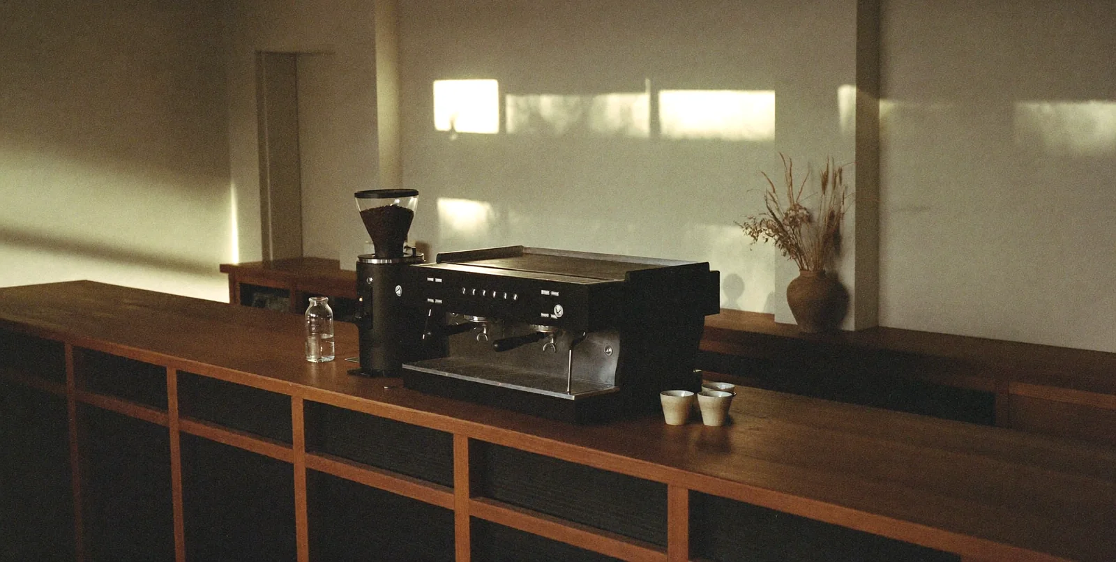
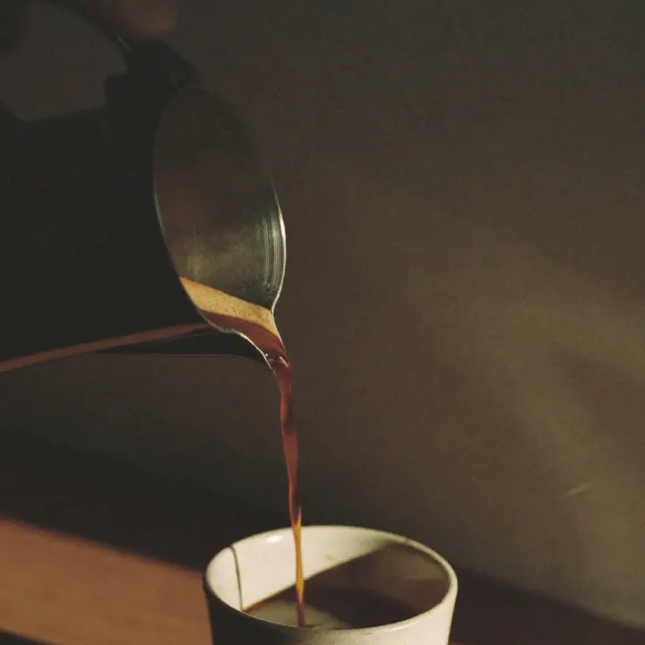

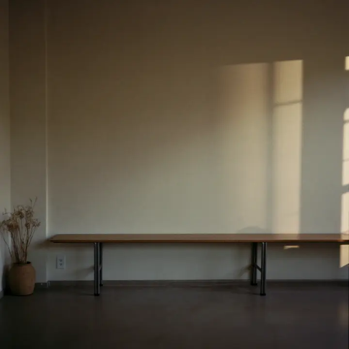
one photo, tinted and reused three times
the photography given room, and a page built around it
sample data — the real thing lives in your portal
Simple to start. Simpler to stay.
Design-and-build projects are quoted fixed, up front — no hourly meters. Ongoing care (updates, tweaks, experiments) runs as a flat monthly engagement you can stop anytime.
What moves the price
- Number of page templates
- Custom features (booking, e-commerce, portals)
- Copy and imagery we create vs. you supply
Before you ask — asked and answered.
Yes — we build around what reception already uses rather than forcing a change.
Your next patient is deciding right now.
No forms, no calls — a straight answer in chat.